Decomposition: Stop the Rot
Decomposition:
Stop the Rot
Mark Greenland
Introduction
This paper is about composing photographs (and any other work of visual art). To do this, we shall have to “decompose” a few pictures, as you might disassemble a machine, but the aim is not merely to reassemble the machine, but to bring it to life. Anyone who has ever been disappointed with a photograph which failed to convey the impact the original scene had on a photographer, has probably had a problem with composition. Often, the disappointment is subtle and the photographer cannot understand why the picture has failed. Sometimes, the reason becomes embarrassingly clear when the photograph is publicly judged.
The Camera Club Rules
Members of camera clubs will be familiar with a set of compositional rules. Although judges are often at pains to deny that these are any more than useful guidelines (made to be broken by the bold), the reality is that if you don’t obey these rules you will frequently lose points. Let’s start by mentioning a few of them before going deeper into their underlying rationale. Here are a few:
- Horizons should be horizontal. Also, don’t have your horizon run through the middle of the picture dividing it into two.
- There should be a centre of interest, which should rest on an intersection of “thirds”. (If the image frame is divided into nine equal boxes by a “noughts and crosses” frame, the thirds are at the four intersections of the four lines).
- The subject should not overlap with distinct background lines (overlaps are “mergers”).
- Moving objects should have more of the picture space in front of them than behind them. Similarly, faces in profile should have more picture space in front of them than behind them.
- Look for leading lines to direct the viewer’s attention to the centre of interest. Leading lines should not lead out of the picture frame. Leading lines should have a “pay off” or interesting element at the back or distant end of the line.
- Don’t have bright areas near the edge of the frame, especially at the top.
- Keep the composition simple by avoiding “busy” backgrounds.
- Put your centre of interest at the right hand side of the photograph because we read from left to right.
- Horizontal lines suggest strength, serenity, formality. Vertical lines suggest integrity, strength and respectability. Diagonal lines suggest energy and movement. A diagonal from bottom left to top right suggests happiness but a diagonal from top left to bottom right suggests sadness.
- Don’t put your subject in the middle of the frame unless it is intended to be a very symmetrical composition.
These rules are no doubt helpful in many instances and most have a rational foundation. However, to apply them slavishly is to stifle artistic endeavour and tend towards those great enemies of Art: monotony and conformity. It is better to understand the underlying theory and treat these rules as no more than guidelines for “safe” composition.
In fact, composition is applied psychology. It is intuitive and a matter of impression, not a precise science. To approach composition as if it were an exam is to relegate your picture to the status of an exercise.
Before the Camera Comes Out
In his book “Photography and the Art of Seeing”, Freeman Patterson suggests approaching your photographic subject by conducting the following analysis:
- What is my response to this subject/scene?
- What exactly is it about this subject/scene that evokes that response or interests me?
- How can I convey that response with my equipment and editing?
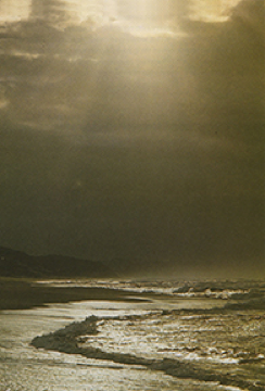
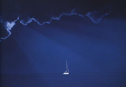
When Freeman Patterson saw this scene he thought of the Creation. After asking and answering the questions above, he decided that underexposure was the key to conveying the feeling he had. He underexposed approximately 2 stops to create the feeling of majesty.
It is surprising how often people photograph something attractive, but which is really best suited to serve as a background rather than as the subject. Backgrounds are at least as important as the subject; it is certainly not a waste of a strongly interesting scene to treat it as a background rather than the subject. Much disappointment arises from the failure of a strong background to make an interesting subject.

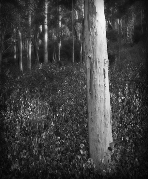
In answering Freeman Patterson’s third question, you might conclude that the composition (as distinct from the actual scene in front of you) would be monotonous unless you introduce some new element, or emphasise some part of the scene. Alternatively, you could consider lighting some part of the scene, to make it stand out from the rest of the scene, and perhaps imbue it with an atmosphere which might evoke your feeling about it.
Pursuing this line of thought, Freeman Patterson remarks that an accurate representation of a scene will often fail to express its significance to the photographer. He refers to the fact that when children draw, they portray the things that are important to them disproportionately large, eg hands and fingers, head, hair, smile, eyes, etc. They do not attempt to draw the scene accurately, but instead make the physical representation of the subject conform to how they feel about it.
There are various ways for a photographer to alter a scene in this way including:
- A colour cast.
- Conveying the scene very brightly (high key) or very darkly (low key).
- Creating shadows or lightening shadows.
- Including and/or emphasising lines in the scene which are vertical, horizontal or diagonal.
- Increasing or decreasing the contrast (ie the difference between the darkest and lightest parts of the picture).
- Increasing or decreasing the size of the subject in the frame.
- Changing the point of view of the camera to be higher or lower.
- Including some extra element between the camera and the subject, such as foliage, a window/doorway, etc.
- Using an unusually short or long lens.
- Deleting from the composition any material which does not contribute to the impression the photographer seeks. Sometimes this means having the discipline to leave out strongly attractive material.
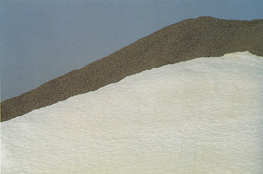
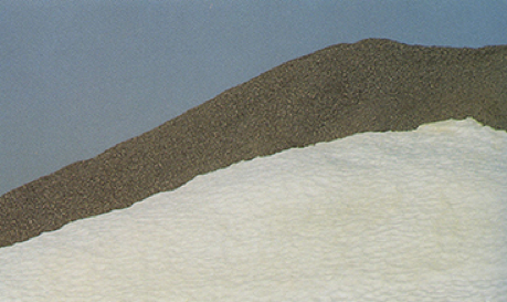
The second image has been cropped at the bottom and left. Is the image more balanced as a result?
Patterson then makes two crucially important points about the photographer’s analysis of a subject. First, the photographer must abstract from the scene the attractive elements. What precisely are the points of the scene which draw the photographer’s eye (or which he could see might draw the viewer’s eye after some editing)? This requires the photographer to temporarily disregard the connective or ambient material in the scene and study what will become the centres of interest. This is critical to constructing the image in a satisfying way, as discussed below.
The second point Patterson makes, is that in the same way, the photographer should analyse the scene in terms of brightness. Often, the centres of interest will coincide with the bright areas, but not necessarily. If there are bright areas which are not centres of interest, some way needs to be found to reduce or avoid the brightness. This study of the contrast in the scene will also assist the photographer to make judgements about exposure. One way to assess the brightness of the scene, undistracted by the details of it, is to squint severely, almost closing the eyes.
This study of the scene, its centres of interest and brightness range, is likely to be the first response of the photographer, long before any camera is raised to the eye. With practice, this study can be carried out very quickly.
In assessing whether to make a picture, and if so, how to make it, it is a helpful but often overlooked step to consider whether the picture would be different from other pictures your viewers will have seen. To create an image unlike any which has been taken before, has merit, even before the merits of the picture itself are taken into account. In considering how to take your picture, you should think about how to render the scene differently from past images.
However, all photographers make conventional images from time to time. The challenge with such images is to make them better than similar images of the past. If you set out to make a picture of a waterfall or a rusty truck wreck in a paddock, don’t be satisfied with reproducing what you have already seen in other images: push yourself to come up with a fresh take on the subject.
This study of the scene as a preliminary to putting the camera to the eye, demonstrates that composition cannot be mastered by memorising a set of rules and applying the rules to the scene. You must start with the scene and its emotional effect on you, and then design the image having regard to design guidelines. The subject, not the rules, must be determinative.
What follows is a discussion of how best to arrange the subject matter to achieve a satisfying design, but is always a case of applying design to present the subject to maximum effect.
Balance
Traditional artistic composition demands that a picture give the appearance of balance horizontally, vertically and (where depth is suggested) in the third dimension. The idea of “balance” in a picture depends on the notion that elements of the picture have a kind of weight. This is a metaphorical way of describing the degree to which the element attracts the eye. A human face, looking at the photographer, has a lot of weight because the viewer will tend to want to examine it.
The farther an element is from the middle of a picture, and the more isolated the element is, the greater its weight. Thus, a small element near the edge of the frame, especially if it stands out from its background, will have as much or greater weight than a bigger element near the centre of the picture.
The trick is to arrange the elements in a way that allows them to balance each other across the image.
At the same time, you should ensure that one element is dominant, in order to avoid dividing the viewer’s attention and destroying the unity of the picture.
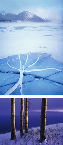
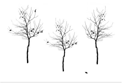
The foreground and background balance each other in 5A, but the foreground is dominant because of the radiating lines. Similarly, the isolated tree balances horizontally with the less dominant group of three in 5B.
As 5B demonstrates, an isolated element in an empty space has more weight than when it is grouped with other elements.
When arranging elements for balance, remember that the viewer’s eye, travelling through the picture, should cross the centreline at least once, otherwise there must be an imbalance.
Below is an example of balance in the third dimension, and horizontally, though the picture arguably lacks balance vertically, there being little to take the eye in the bottom half.
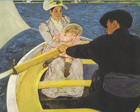
Notice the centrality of the baby, around whom everything appears to be arranged. If you unthinkingly follow the camera club rule of never putting a subject in the middle of the picture, you overlook the possibility of creating a central composition which is balanced across the middle.
There are numerous features which will draw the viewer’s attention to an element and thereby give the element weight. Here are a few:
1. Contrast. The eye is drawn to any boundary between light and dark, especially if the boundary is sharp.
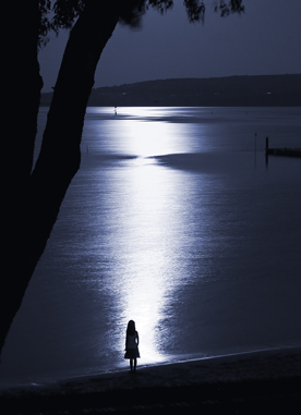
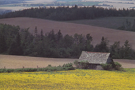
It is probably this point which underlies the camera club rule against having bright areas at the top of the frame. The problem of course is not the bright area, but the distracting quality of the contrast between the bright area and its surrounding darker areas. In image 9, the row of dark trees near the top contrasts with the lighter background and distracts from the building. Why not crop the top out?
In image 10, the contrasting landscape in the background drags the eye away from the people, who seem to be the primary subject.
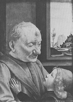
Contrast can be your enemy, or you can use it as a device to draw the viewer’s eye where you want it to go. The contrast in image 11 is at the subject. The eye is not dragged to the edges of the frame, just because they are bright. In image 12, the contrast between the dress and the water leads the eye out of the frame, but in image 13, the eye favours the brighter girl because she contrasts more with the background.
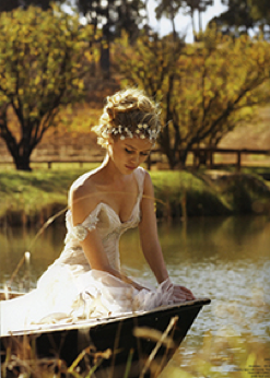
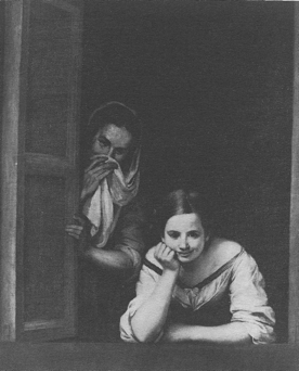
2. Distance from the Centre.
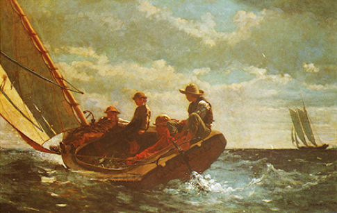
Notice that the smaller yacht balances the larger more colourful yacht simply by being nearer the edge of the picture. Because it is obviously farther away, it also creates balance in the third dimension.
The weight of an element near the edge of a frame begins to diminish as it leaves the frame, ie if the edge of the frame cuts through the element. This would be criticised by a camera club judge, but one way of reducing the weight of a person at the edge of a frame is to crop through the person.
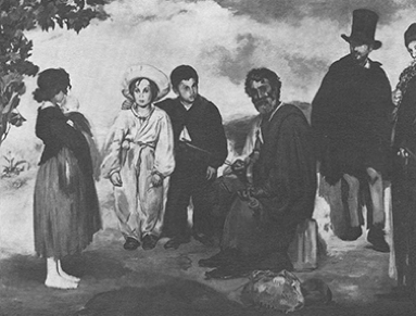
3. Isolation. Moving an element away from other similar elements draws attention to the isolated part.
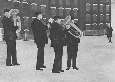
4. Sharpness.
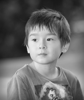
5. Face/Eyes.
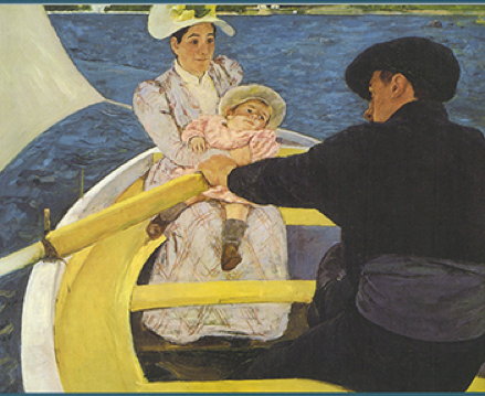
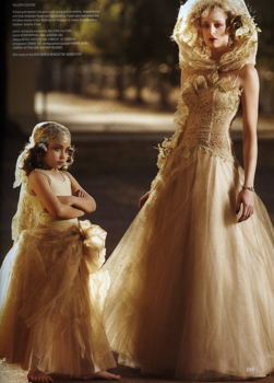
Notice in image 19 that the little girl’s face takes the eye first, even though other parts are brighter. Notice also that none of the centres of interest in this image is on an intersection of thirds. Nevertheless, the image appears to work. The back of the little girl’s skirt is probably redeemed by her bare feet! That is, the eye jumps to the feet instead of sweeping out of the frame.
6. Size.
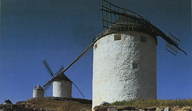
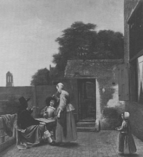
The main group in image 21 is balanced by the smaller girl in isolation, but also by the large building at the edge of the frame.
7. Colour.
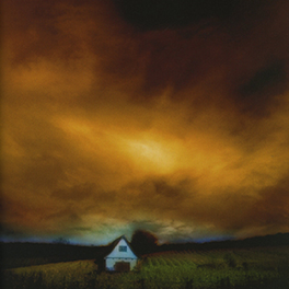
The colour and size of the cloud trumps the contrast and brightness of the house.
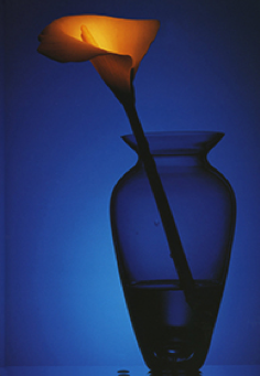
8. Intersection of Lines. Elements located at the intersection of lines have increased weight by virtue of the pull of the eye along the lines to the element.
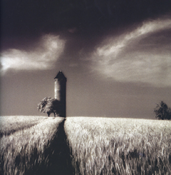
As mentioned above, balancing elements does not mean creating elements of equal weight. As discussed below, the picture will benefit from a single dominant point of interest offset by less dominant elements, such as the tree at the right side of image 24.
9. Golden Ratio. Some writers try to take a scientific approach to placing the centres of interest in the frame. For example, you will see reference to the “golden section” or the “golden mean”. This is an attempt to identify mathematically, those parts of the frame where points of interest receive the most attention and achieve the greatest balance. You may have heard the expression “golden ratio”. Without getting stuck in the mathematics, the golden ratio is approximately three fifths, which is, in turn, approximately two thirds. This probably give rise to the rule of thirds. It is probably more practical and flexible to think of the rule of thirds as the requirement not to put the predominant centre of interest in the middle of the picture or at the edge.
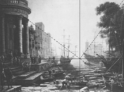
In this diagram, the dotted diagonal intersects with the other dotted line at right angles to it and connecting it with a third corner. The intersection point between the two dotted lines is the centre of the two full lines connecting all four sides. The placement of elements on the resulting seven lines is supposed to achieve a pleasing balance, as indeed it does in this picture.
However, balance in composition is not everything. Even a balanced picture will benefit from arranging or treating the elements in such a way as to induce the viewer to move around the picture in a way intended by the author. This is the next topic.
Entry/Exit: Directing the Eye
The importance of a predominant centre of interest is that it immediately attracts the attention of the viewer and forms an entry point into the picture. This gives the photographer control over the viewer’s movement around the picture. It is desirable to conduct the viewer around or through the picture in a way that avoids the viewer sliding out of the frame prematurely, and losing interest. It is the desire to do this which underlies the camera club rule not to put a centre of interest in the middle of the picture. In that case, it is said that the viewer’s attention will slide from the middle to the edge and out. However, that fear is probably an oversimplification. There can be no criticism of a central subject if the viewer stays there or preferably is given secondary centres of interest which will keep the viewer’s attention and perhaps bring the eye back to the centre.
According to Donald W Graham in his book, “Composing Pictures”, the viewer’s eye swirls around the picture the way a fly circles around food. In other words, the eye does not travel in straight lines, or jump, from one centre of interest to the next, but instead describes graceful curves around centres of interest, swinging on to the next one without sudden angular changes of direction. Graham contends that a simple picture with one centre of interest is not necessarily rewarding to a viewer. It is preferable to provide a predominant centre of interest as an entry point into the picture, and then place secondary centres of interest (which he describes as “foils”) along the path which the photographer wants the viewer to take. It is critical to avoid distracting elements or lines which would lead the viewer away from this path.
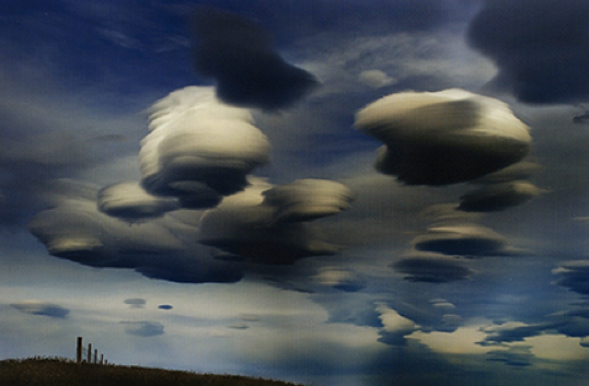
In image 26, the shape and contrast of the fence create an entry point, from which the eye will sweep to the nearest cloud and continue around the clouds in a circular fashion, until released from the image by the small cloud at the “back” leading towards the bottom edge of the frame. It will be appreciated that the entry point, at the fence, did not need to be on an intersection of thirds.
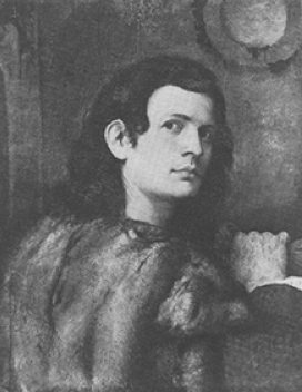
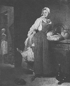
In images 27 and 28, the entry point is obviously the face of the subject, and the eye is led by bright areas down the right arm of each subject and thence across to an exit. In the case of the young man, the exit is the suggestion of a doorway behind him, but the doorway is carefully darkened to avoid competing with the entry point. In the picture of the female, the eye is intended to move to the figure in the background, and thence to the small light area above her, which is the exit. You will note that the exit in each case is carefully played down in order to avoid having the viewer jump to the exit too soon.
The idea of conducting a viewer to an exit from the picture is probably anathema in camera club circles but would not be unusual to a painter. Photographers like to try to capture the eye, with no escape.
In many types of picture, especially portraits, a triangular or elliptical composition provides stability as well as leading the eye around the image and keeping the viewer away from the edges.
Ansel Adams recognised the value of containing the viewer’s eye within the picture, by preventing the edges from becoming too light.
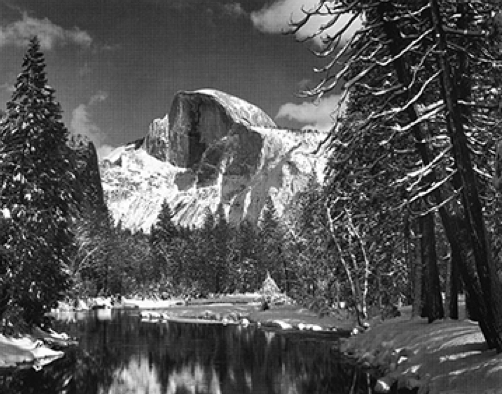
Unfortunately, dense vignetting has become an inadequate substitute for a careful composition. It is a mistake to think that a bright central area surrounded by dark edges is all a photographer needs to do. Further, vignettes are frequently applied with such a heavy hand that they draw attention to themselves, which is precisely the opposite of their purpose.
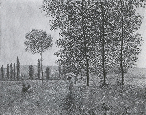
Notice that in image 31, the eye enters with the figure in the foreground, moves up the tall trees, but does not leave the frame, because of the pulling power of the single middle sized tree in the background and thence on to the row of smaller trees in the far background, before returning via a dark contrasting area, to the entry point. Notice that the bright area at the right hand edge of the frame does not damage the composition, contrary to camera club rules. This is simply because the painter was able to capture the viewer’s eye with the shapes of the trees.
Compare that with image 32.
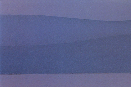
Although some might argue that the viewer’s eye is conducted along the edges of these strata, the lines constantly conduct the viewer out of the frame because there is nothing else within the frame to attract the eye.
The path taken by the eye around a picture need not conform to any particular shape. It need not be circular, elliptical, pyramidal, or square. It might be a simple diagonal or horizontal reverberation, or it might be like the flight path of the fly, swooping through the picture and out again.
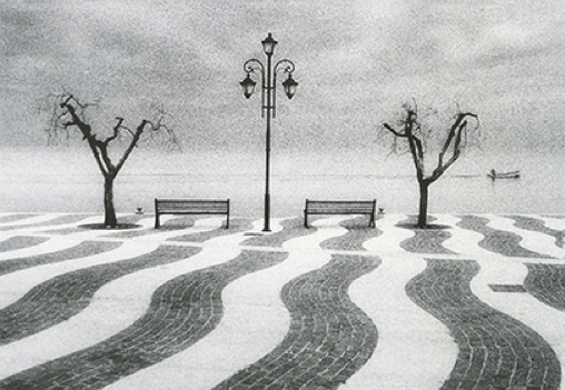
At first sight, image 33 appears highly designed and balanced, but the central post and the boat divide the viewer’s attention. However, a case might be made for starting at the left side tree and swooping up and down the foreground lines, until the boat provides the implied exit. This is a bit too energetic for the writer’s taste.
Various Line Shapes
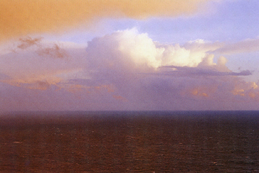
Strong vertical or horizontal lines completely traversing the frame tend to divide the image. The classic example is of course, the horizon (image 34). This can be avoided by interrupting the horizon line with something incidental, such as bushes (image 35). However when the subject interrupts the horizon, a merger can occur, so this is best avoided (image 36)


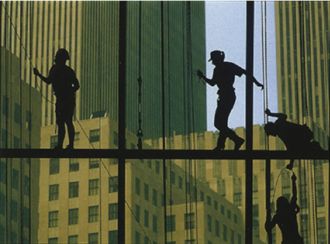
In Image 37, the dark horizontals and verticals don’t destroy the integrity of the picture because the discrete boxes are the whole point of the image.
When you are faced with strongly horizontal or vertical lines which could divide the picture, consider pushing them into the background and uniting them with an intersecting line, as in image 38.

Diagonals convey drama and movement (image 39)
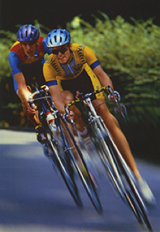
But, care must be taken to avoid splitting an image with a diagonal from one corner to another. For this reason, photographers often make diagonals start from near, but not at, a corner.
The “S” curve is much sought by photographers, not only because it suggests the graceful feminine line, but also because the eye (whether male or female!) tends to follow it.

Analysing an Image
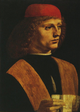
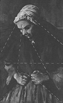
Applying the camera club rules, this picture rates poorly. The face (which is obviously the primary centre of interest) is on the right hand side of the frame, so that the negative space (ie the space which is not a centre of interest) behind the face is wider than the negative space in front of it. The cropped hand at the bottom of the frame is distracting from the face and cropping of hands is nearly always criticized. The note held by the hand is a bright area at the edge of the frame.
The painter of this picture, Leonardo da Vinci, would probably be irritated by such criticism. He might respond by pointing out that the face of the subject is the entry point and the eye flows naturally down the highlighted hair on the right side of the face to the diagonal coloured band on the subject’s shoulder and chest. The eye then sweeps down to the bright fingers, but is prevented from leaving the frame at the hand, by the fact that the back of the hand is dark and the fingers are horizontal. He might then point out that the eye is directed by the bright horizontal fingers to the bright piece of paper, but is again discouraged from leaving the frame by the darkened corner. The eye then sweeps back up the other light coloured band on the front of the subject’s clothing, to the face. Signor da Vinci might then point out that the face is approximately on an intersection of thirds and the light band of colour from the subject’s right shoulder across his chest forms a balancing foil, also on an intersection of thirds, diagonally across the picture.
Thus, when the picture is analysed according to the principles discussed above, rather than camera club rules, the photo judge might have to increase his score from 12 to 15 out of 20!
Epilogue
Good composition won’t necessarily produce a good picture. However, poor composition is likely to spoil a picture. Good composition is only a means to an end. It is part of your preparation. We all need to analyse our picture structures before making the pictures, as well as afterwards.
Although detailed analysis of the composition is necessary when creating a picture, and when editing it, you have to avoid slipping into the habit of viewing others’ images purely in terms of their composition, for once you approach every image with a view to dissection, the images will lose their flavour. You do not want to be like the audiophile who listens to the CD player, amplifier and speakers, rather than the music. Let’s hope we can all (especially judges) appreciate photographs intuitively and as a whole, and not check them off against compositional criteria or rules.
Bibliography
1. Pictorial Composition,
An Introduction
Henry Rankin Moore
Pub 1976 Dover Publications Inc, NY.
2. Photography and the Art of Seeing
Freeman Patterson
Pub 1985 – 2004
Key Porter Books Ltd, Ont.
3. Composing Pictures
Donald W. Graham
Pub 1970 Van Nostrand Reinhold Co, US.
4. Photography, the Art of Composition
Bert Krages
Pub 2005 Allworth Press, NY.